
Northwestern’s student portal CAESAR launches new layout
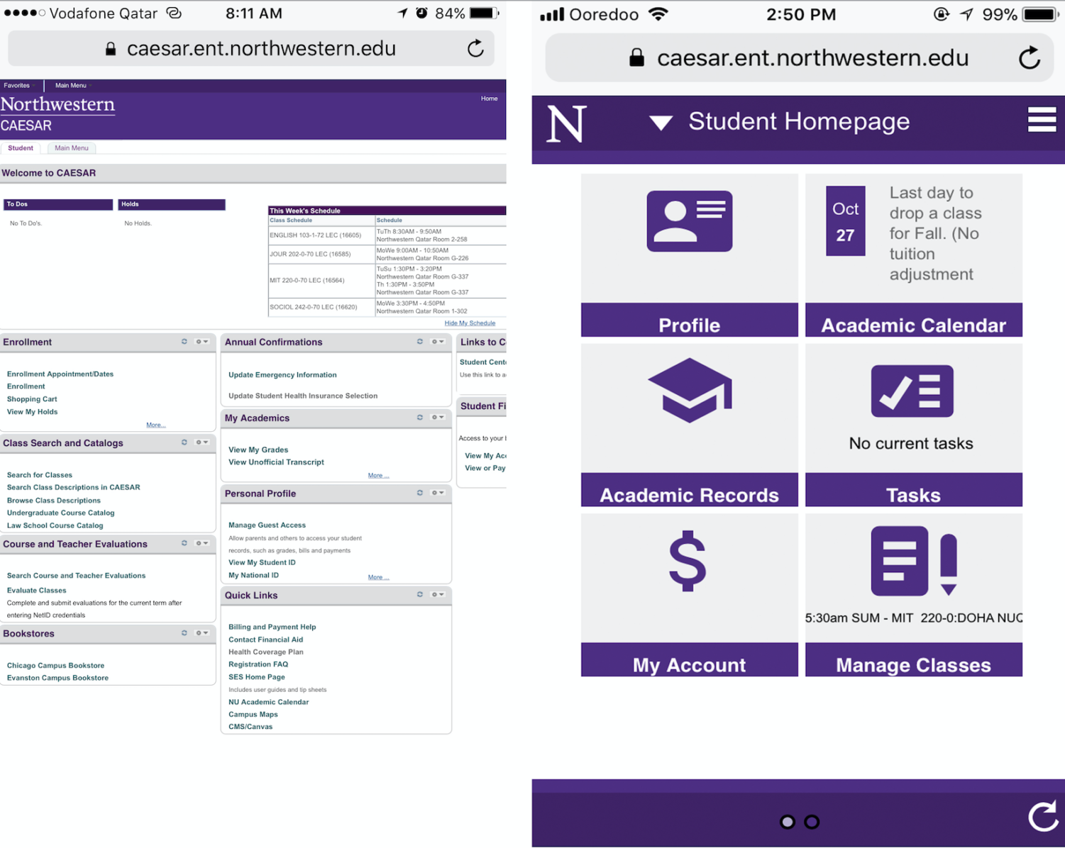
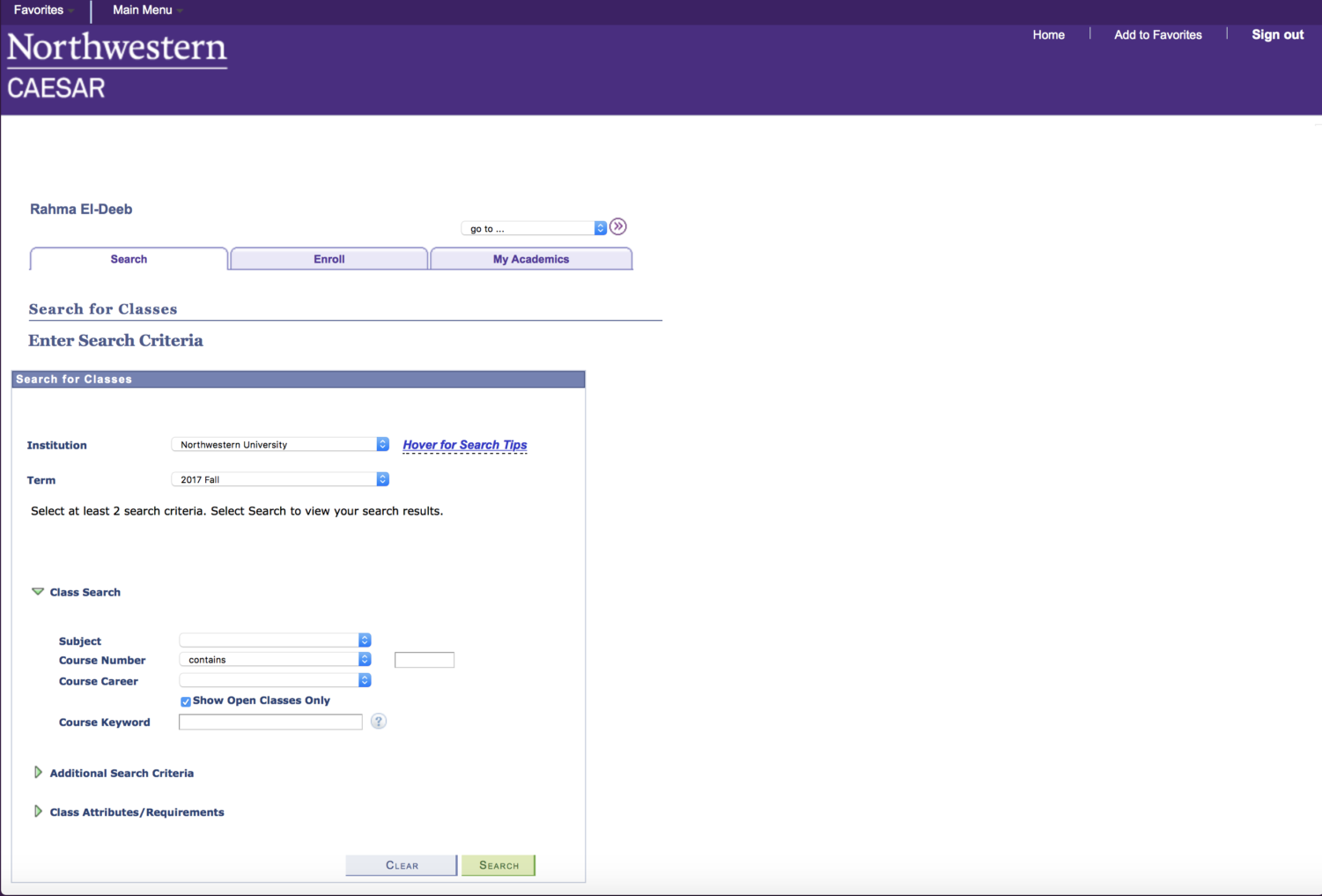
CAESAR, Northwestern University’s student information portal, relaunched with a new design and layout on Oct. 16.
This upgrade was in response to continuous student complaints regarding difficulty in navigating the website. Speaking to The Daily Northwestern, the student-run publication at Northwestern’s Evanston campus, Director of Student Enterprise Systems Ann Dornen said, “We do an annual survey to students and this has been pretty high on the list of complaints…so we took that to heart,” adding that student focus groups were held in Evanston to help with design-related decisions.
The new design makes it easier and more intuitive for students to use, while adding a new mobile-friendly aspect, according to Robert Vance, director of information technology at Northwestern University in Qatar.
Many students at NU-Q said they are pleased with the changes.
One of them is NU-Q freshman Shafaq Zia. She said that the re-vamp makes the site much easier to use, “allowing one to access it any place, any time,” particularly with their mobile phones.
Rui Xin Oh, a fellow freshman, agreed with Zia, adding that “it’s easier for me to navigate the site without having to worry about clicking other links by accident. Being redirected to other sites gets really frustrating after a while.”
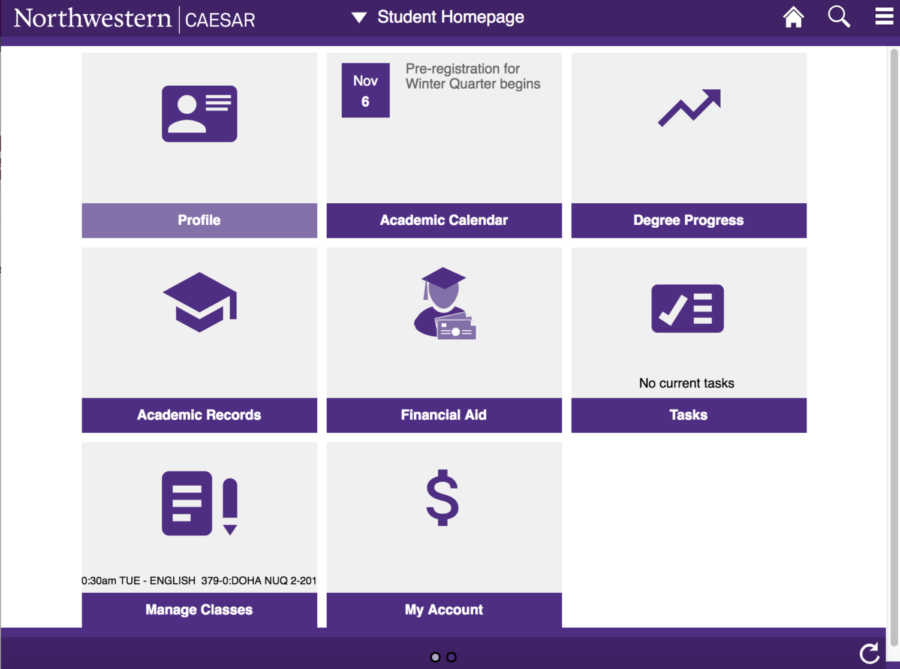
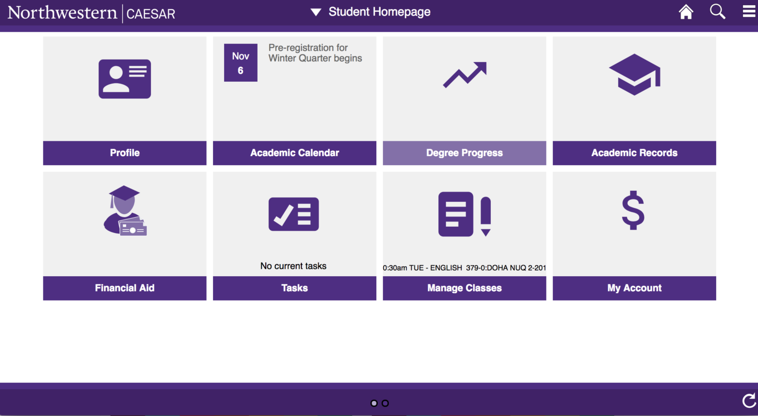
The most noticeable aspect of the re-design is the new CAESAR homepage.
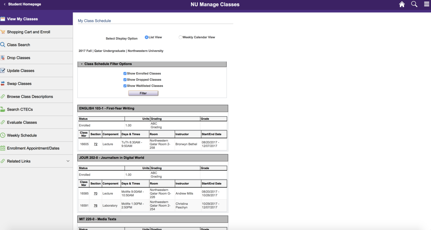
Instead of numerous pop down menus, it now features six main destinations: student profile, academic calendar, academic records, tasks, financial account, and class management.
“It’s so much more modern… and now there are pictures that make it easier, so as soon as you open it you identify things you need to pick out,” said Zia.
Zaki Hussain, a NU-Q communication senior, agreed, saying that “it’s cool, it’s minimalistic, so much less clutter than before.”
Nouf Al Sulaiti, a communication senior at NU-Q, was excited but also weary of some of the changes. “I guess because our eyes are very used to the old one, it’ll take time for everyone to manage this. I’m not thinking it’s impossible. It’s just going to take some time,” she said.
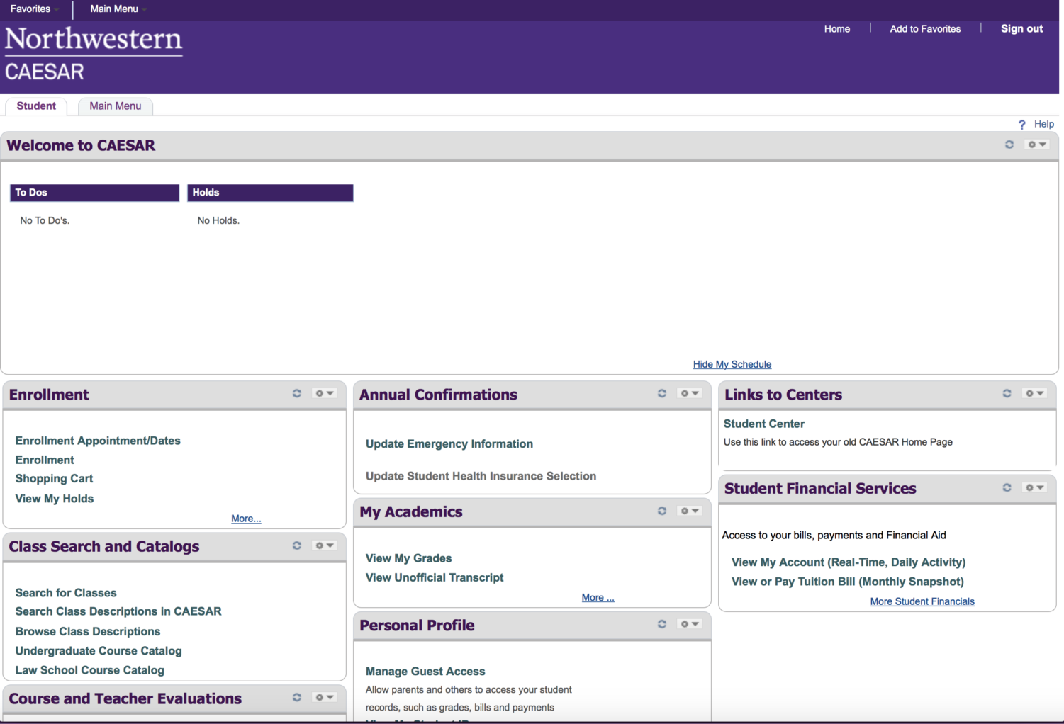
Hussain agreed, adding that in some instances, the older portal made navigation through CAESAR easier. “There was a drop-down menu, and you understood the compartments… what if I want to search for classes or check my tuition? It was more straightforward,” he said.
Still, others said that the overall navigation has improved. Many said they found it to be a smooth transition and a refreshing change.
“Before, to enroll in classes, it was very complicated… there were too many tabs. Especially as a freshman, it’s confusing,” stated Mariam Kamal, a freshman herself at NU-Q. “But now, new freshman will find it easier,” she added.
Similarly, Salwa Sadek, a journalism sophomore, said she appreciated the ability to manage her student profile herself. “Before, personal details weren’t this easy to manage. You couldn’t edit your own information; you had to go to student records if your information was incorrect. Now I can edit it myself,” she said.
The ultimate goal of the project was to improve student experience, according to Vance.
“It is my hope that the updates will help lead to an outcome where students are spending less time navigating CAESER for the information or task, leading to a more efficient experience overall,” he added.
Moving forward, in order to ensure the continued functionality of the update, NU-Q’s role will be to “monitor CAESAR to ensure the tool meets the needs of our students,” said Vance.