VCUQatar launches new name and logo to honor 20 years in Qatar

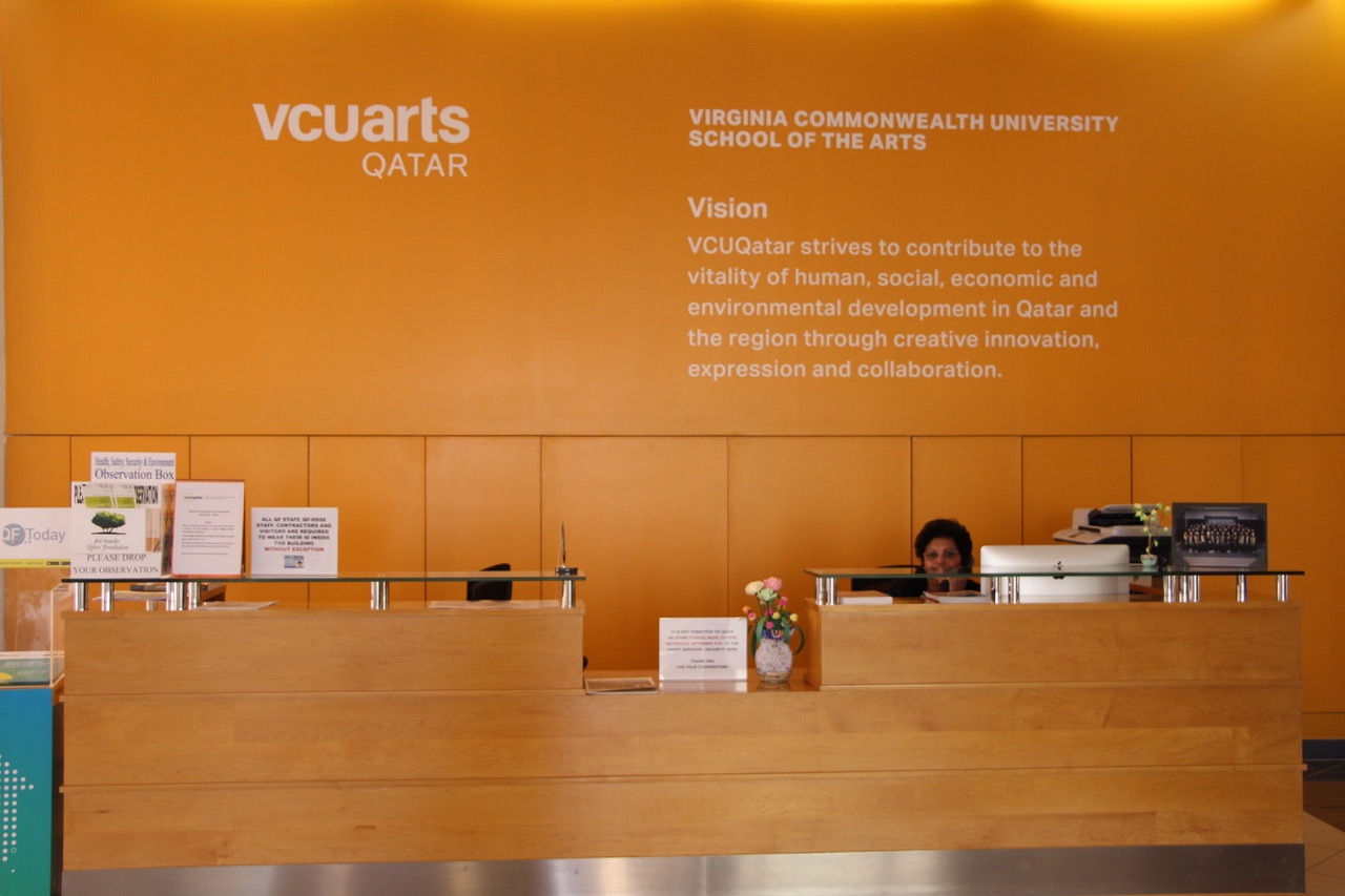
In celebration of its 20th anniversary, Virginia Commonwealth University in Qatar has updated its name and logo. It will now be called Virginia Commonwealth University School of the Arts in Qatar and abbreviated as VCUarts Qatar instead of VCUQatar.
The previous name did not include School of the Arts, and the logo did not have the word arts. The colors of the logo also have changed from black and gold to yellow, red and black; it now more closely resembles the VCUarts in Richmond logo.
Hallema Sharif, VCUarts Qatar’s executive director of communications, described the change as more of a brand alignment with its main campus, VCU School of the Arts in Richmond.
“The alignment is bigger than a brand or a logo,” Sharif added. “It is about relevancy. It is about making sure that we stand out and that we can lead the conversation about arts and design.”

Sharif called it a “comprehensive change” because the university’s operational agreement, drafted in 1998, states that it is an arts school. The old branding, however, reflected VCU as a whole instead of VCU’s School of the Arts specifically.
She said she views the alignment as a chance to dismiss the stereotypical image of the arts. By adding the new logo to university projects, Sharif said it can demonstrate how art and design contribute to every industry, and that students are not just looking at “coloring books,” as a preconceived stereotype suggests.
However, some students disagree.
Naurin Najeeb, an interior design junior, said she is upset with the change because she had integrated the previous logo and abbreviation in her earlier projects. For example, Najeeb typed VCUQatar on the cover page of a book she published a few weeks ago at their library.
Additionally, Faheem Ahmed Khan, a graphic design junior, said he understands why the logo changed from VCUQatar to VCUarts Qatar. He added that he recognizes the benefits of explicitly connecting VCUarts Qatar as a sister branch of the number one public arts school in the United States in 2017, according to U.S. News & World Report.
However, Khan said that the placement of Qatar in the logo looks “hideous.” He added that the old logo distinguished the Qatar campus from VCU in Richmond because it was different, whereas, the new logo mainly reflects the main campus. “It was unique to us,” he said.
Dimitri Yuri, a senior, also expressed concern that the updated university name does not fully represent all of its students, such as those majoring in liberal arts rather than in fine arts.
“The name VCUarts paints a picture that we are all artists in there, which makes the art historian in me feel left out. We exist too, you know! We’re just buried underneath some books and scholarly journals,” he said.
VCUarts Qatar offers four different bachelor of fine arts degrees and a bachelor of arts in art history. In Richmond, art history also falls under the VCU School of the Arts program.
However, Yuri said he does appreciate the design of the new logo. The color changes add more life to the logo, making it more “playful–which is what our campus is all about,” he said, adding that he thought the previous colors of black and gold were monotonous.
Manahil Mirza, an interior design sophomore, is also a fan of the new logo. “I actually love it very much,” she said. “It’s like a better label.”
According to Johana Nasreen, a fashion design senior, the changes make more sense because “VCU’s main campus has so many different departments, and the only one we can actually relate to is the VCUarts department.” She added that the new logo comes across as “more professional and standard” than the previous design.
Faculty have gotten onboard with the university’s re-branding as well.
Johan Granberg, an interior design associate professor, said he sees the changes positively because VCUarts Qatar is an art school, and the core of what they do and think is art.
He added that Qatar is interested in art and that the university was able to brand art efficiently for the past 20 years. However, further work needs to be done so that Qatari society can understand and appreciate art even more.
“We have to educate people that behind these beautiful paintings, beautiful chairs, and the beautiful sign of a hotel lobby is a very sloppy and dirty process,” Granberg said.
Cherif Amor, the chair of interior design at the university, described the process as a transitional phase where some people will complain and others will be unhappy, but over time they will adapt to whatever is new. He said the new logo is an opportunity for anyone to recognize VCU in Qatar as an arts school.
Since the university unveiled the new changes on July 1, 2017, VCUarts Qatar has updated the logo on its website, entrance and parking lots. However, school officials said a lot still has to be changed, such as employee business cards.
A full launch is expected to be held in the middle of next year, right when VCUarts Qatar celebrates its 20th anniversary, according to Sharif.
Correction: Oct. 4, 2017
A previous version of this story mistakenly identified Johan Granberg as an assistant professor. He is an associate professor.
The article also has been updated to include additional student quotes and contextual details.


